
Visualise your Google Search Console Data
The Google Search Console (formerly Google Webmaster Tools) provides you with inside information on how your website is performing in the search results. However the presentation of the data is limited and it is quite hard to understand the true meaning behind it.
These charts take that data and attempt to make it easier to decipher.
By default the tool shows example data for my own website.
Bonus: The tool also works with exported Page data. See how your page rankings are changing.
Input your Data
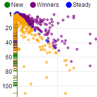
Position Change Bubble Chart
Emphasising any improvements or loss in average query positions. The bubble sizes are based in impressions. Top right shows the big wins and bottom left are the big losses.
Query Data Table
Query Relationship Graph
This chart links query terms based on the words they contain. Each bubble represents a query term and its size relates the the impressions it gets. Orange indicates 10 or more impressions.
Hover over bubbles to see its query term and other information. You can also drag the chart and bubbles around and zoom via your mouse wheel or double clicking (shift to zoom out).